A route with
a point of choice.
The open loop is the gateway. The outward arrow is the decision to take a route. Together they form a compact, directional mark with a recognisable silhouette at small sizes.






16 units
Minimum clear space around the 64-unit mark canvas.
Keep it readable.
Use the mark at 24 px or larger. Use the wordmark at 148 px or larger. Use the dedicated favicon inside very small browser UI.
Keep it consistent.
Use the supplied artwork in proportion. Keep the loop and arrow together. Select the colour variant with clear contrast against its background.
Keep it precise.
Write the product name as OptinRouter. Wordmarks use outlined Manrope artwork, so no font installation is needed to display them.
Calm by design.
Clear in use.
Warm white creates space. Ink anchors the interface. Mint identifies moments of action, while forest green supports labels and interactive states.
Use ink text on mint. Use paper text on ink or forest. Mint is an accent surface rather than body text on paper.
Manrope / geometric sans
ABCDEFGHIJKLMNOPQRSTUVWXYZ
abcdefghijklmnopqrstuvwxyz
0123456789 & @ / →
Open font licensed under SIL OFL 1.1. The website hosts its own font files. This document embeds its own font files for portability.
Font licence ↓64–80 / 1.05 / 700
36–48 / 1.15 / 600
20–24 / 1.3 / 600
16–18 / 1.6 / 400
11–12 / 1.5 / 600
Tangible infrastructure.
Considered detail.
Custom generated glass and metal sculptures extend the routing idea into a tactile visual language. Use one focal image with generous space and restrained motion.




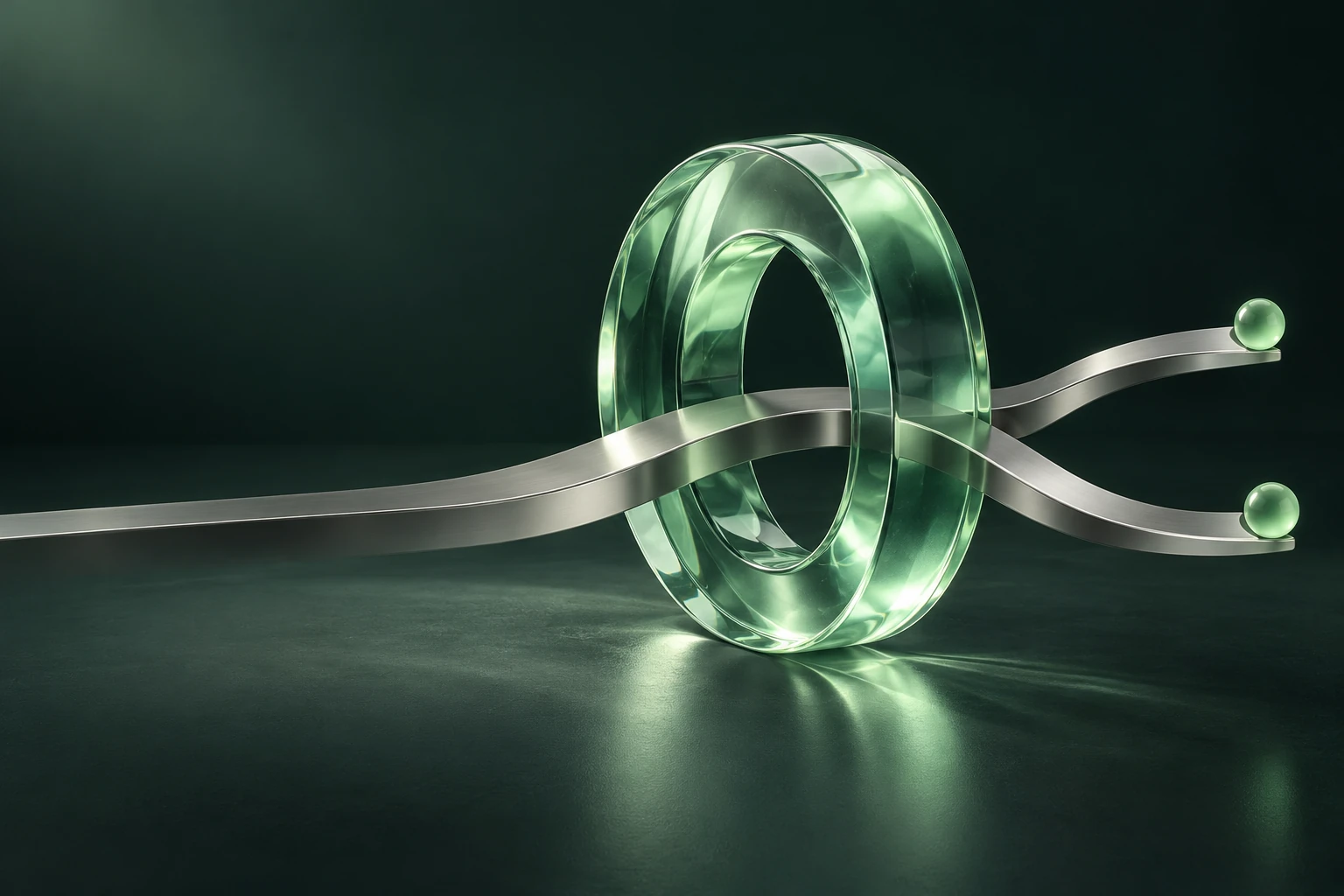

Make room for the object.
Let the silhouette remain the focal point. For the hero, fit the whole loop. The dark composition can be cropped around the glass gateway.
Keep copy in the interface.
Typography stays in HTML, or in editable vector artwork for social assets. The generated images contain no text or product claims.
Ship the right file.
Use the optimised WebP images on the web. Smaller 768 px variants are provided. Original PNG files are retained for future design work.
04 — VOICE & MESSAGING
Engineer to engineer.
With clarity and care.
The identity should feel capable and direct. Explain the mechanism, make choices visible, and place useful detail close to the decision.
- Lead with agency. “One gateway. Your terms.”
- Be specific. Use route, review, submit, accepted, credits and rate discount.
- Distinguish current and planned. Availability, pricing and programme claims should match product state.
- Show the evidence. Link technical claims to the corresponding documentation or measured result.
- Respect independence. Name compatible tools descriptively; use vendor branding only with appropriate permission.
Ready to build with.
Production vectors, transparent exports, browser icons and design tokens. All logo masters contain outlined paths and scale without losing definition.
Identity masters
Primary and reverse lockups, plus single colour artwork for print and compact placements.
Dark wordmark ↓Light wordmark ↓Black wordmark ↓White wordmark ↓

Marks & icons
Transparent mark PNGs in 256, 512 and 1024 px, and an SVG favicon with a solid background.
256 px ↓512 px ↓1024 px ↓Favicon ↓Touch icon ↓




Design system
Portable colour and typography tokens, a font licence, asset metadata and generation prompts.
CSS tokens ↓JSON tokens ↓Image manifest ↓Art direction prompts ↓